Monochrome Illustration Techniques

Young H G Wells (Incomplete)

Young H G Wells (Incomplete)

The image above was intended as a portrait of the young H G Wells. I started work on it while I was an undergraduate student, but, unfortunately in retrospect, I never finished it.

Even though the drawing is incomplete, I’ve scanned and posted it now because it is one of the few surviving examples of my artwork that uses a monochrome stippling technique.

Over on my professional blog, I just published a new post—The Age of Monochrome Illustration—reflecting on the significant changes in commercial illustration practices that have taken place during the past quarter century or so. On looking back at the work that inspired me in those days, I was astonished to realize just how much things have changed since then. It was a “given” back then that most illustration work would be printed in monochrome, and it had been that way since the dawn of mass printing.

Looking through my own remaining artwork to find images for the post, I had no difficulty finding examples of artwork that used cross-hatching, but an example of the stippling technique was less readily available.

I can think of only one area of electronic publishing where monochrome artwork may still be preferred, and that is for eBooks that are to be read on eInk devices such as the Kindle Paperwhite. However, that’s not necessarily much of a restriction, because the same publications can, in general, be read on compatible readers with full-color screens. I’m not aware of any cases where eBook artwork was deliberately created in monochrome for that reason.

Kirkham Priory Postscript

My Pencil Drawing of Kirkham Priory, 1974-75

My Pencil Drawing of Kirkham Priory Gatehouse, 1974-75

The image above is a pencil drawing that I executed at school in 1974-75, when I was about fourteen. It shows the gatehouse of Kirkham Priory, which was the topic of my previous post.

The gatehouse of the Priory is probably the most famous and recognizable portion of the remains, and has been drawn, painted and photographed many times over the centuries. My own effort wasn’t entirely original, being heavily based on a lithograph produced by William Richardson in 1848.

As I mentioned in the previous post, Kirkham was and is a major tourist attraction, and the same portion of the ruins even featured in railway posters during the twentieth century.

Edit 7/23/17: I obtained the press photograph below via eBay some time ago. The print is dated October 24th, 1927.  It shows the remains of Kirkham Priory just before the Office of Works began excavations.

Kirkham Priory before Excavation, 1927

Kirkham Priory before Excavation, 1927 (Copyright the Times)

The caption on the back of the photo says:

A view of part of the ruins of Kirkham Abbey, in the valley of the Derwent, Yorkshire, which have recently been handed over to the Office of Works by Sir Edward Allen Brotherton. The Abbey was founded by Walter L’Espee [sic], the founder of another Yorkshire abbey, that of Rievaulx, in the North Riding. The work of preservation, which the Office of Works is carrying out, will probably take two years to complete.

St. Martins School of Art: A Life-Changing Experience

Life Drawing Sketch, St Martins School of Art, 1982

Life Drawing Sketch, St Martins School of Art, 1982

The illustration above shows one of my very earliest “from life” pencil sketches. It was done during an Illustration class at St. Martins School of Art, London, during 1982. Strangely, prior to that, I had never participated in a formal “life drawing” art class anywhere.

My tutor at that class was an artist called Ian Ribbons. I’m ashamed to say that I knew nothing about Mr. Ribbons at the time, and it was only many years later that I discovered that he was in fact a successful and famous illustrator in his own right.

Developing a Technique

In earlier posts, I’ve exhibited a few later examples of my figure drawings from live models. Those examples were drawn when I’d already gained some experience of life drawing, and some confidence with my preferred technique. However, that knowledge was hard-won, and, as I’ve previously indicated, I seriously lacked confidence in my figure drawing skills until I reached my early twenties.

My lack of competence wasn’t entirely due to my own shortcomings. The inadequacy of what was offered to me as “Art education” at school did nothing to reinforce my confidence or help me to improve. We were not given any classes in drawing the human figure, ever, even as part of the so-called “Advanced Level” course, which seems appalling in retrospect. Occasionally we were given a homework assignment to “do a self-portrait” or “draw some people”, but with no accompanying guidance or help, so inevitably the results were disappointing and demotivating.

(I’m aware that I wasn’t the only one to suffer from this “teachers shouldn’t try to teach” approach to education. There seemed to be a weird but common attitude that trying to inculcate drawing or aesthetic expertise was somehow tyrannizing innocent students, who should instead be left to wallow in ignorance. The result was that we now encounter many “artists” who seem unable to summon much actual artistic skill, which must surely be frustrating for those who are aware of it.)

It was only when I got to Imperial College, and volunteered to be the Publicity Officer of the H G Wells Society, that it dawned on me that I might have “bitten off more than I could chew”. I realized that I was probably going to have to draw people, for public display, and make it look good! It somehow occurred to me that some professional instruction might help, so I sought out the course at St Martins.

Ian Ribbons

As I mentioned above, my tutor at St. Martins was Ian Ribbons. Years after taking the Illustration class there, I stumbled across a copy of a 1963 book called Illustrators at Work, at a secondhand book shop. The book’s dustcover is shown below.

Illustrators at Work, 1963

Illustrators at Work, 1963

As the cover shows, the book was compiled by the famous British illustrator Robin Jacques (who was the brother of the actress Hattie Jacques), but it includes biographies and samples of the work of many other British artists. There, on page 45, was a section about Ian Ribbons, complete with the following biography:

Ian Ribbons Biography from "Illustrators at Work"

Ian Ribbons Biography from “Illustrators at Work”

Incidentally, the same book also includes a section on Ronald Searle, another well-known British artist, who happened to be a bunkmate of my mother’s first husband in the Japanese POW camp at Changi, Singapore, during World War II. I’ll have more to say about him in a future post! [9/25/20: Now posted. See The POW Artists of Changi]

Benefits of the St Martins Class

There’s no doubt that Ian Ribbons’ guidance was excellent, and it helped me gain some vital artistic confidence, in a way that I had not remotely anticipated. Without that inspiration, I probably would not have produced much of the publicized artwork that I subsequently created while I was a student in London.

For the first time ever, I felt that I had the ability to produce work that could credibly be displayed in a public setting without inducing (unintended) laughter. In retrospect, not all of what I produced in those days was good, but at least I wasn’t paralyzed by perfectionist concerns.

I must add that another major benefit of the Illustration class at St. Martins was simply the opportunity to work alongside other not-so-famous, but very competent, professional artists. There wasn’t really any program of formal instruction, but each of us was working on our own drawings and developing our own techniques.

If I saw another artist using a technique that interested me, I could simply lean across and ask, “How did you do that?”

That was, in fact, how I learned the ballpoint pen technique that I used for the portrait of Pallab Ghosh. Another artist at the class had already used that technique (for a portrait of actor Roger Moore, as I recall), so I simply asked him about it, then tried it myself. I doubt that I would ever have thought of such a technique without his example to look at!

Pallab Ghosh as "Super-Ed" (Superman)

Pallab Ghosh as “Super-Ed” (Superman)

I don’t think that I have ever before or since found myself working among such a concentrated group of talented artists. Presumably that was due to the location: we were in Central London.

Jeopardizing My Degree?

When my tutor at Imperial College learned that I was taking a part-time class at St. Martins, he expressed concern that it could detract from my engineering studies, and possibly even jeopardize my prospects of obtaining a degree! (I was working at Selfridges on Saturdays too, which was also deemed inadvisable.) Fortunately, all those concerns turned out to be nonsense, and I’m really glad now that I took that opportunity to “broaden my horizons”.

Moggies Cartoon: Independence Day

Moggies: Independence Day

Moggies: Independence Day

This was the first “Moggies” cartoon that I created for display at the Sonoma County Fair. It seems like an appropriate time of year to post this episode!

I already posted the other two Moggies cartoons (Pure Water and Royal Blood). As you’ll have noticed, this first example was not in color. When I began producing comic illustrations about 30 years ago (long before this cartoon, of course), monochrome artwork was still very common, due to limitations of the printing processes. Now, however, there’s rarely a need to print only in monochrome, even in newspapers.


Fishbourne Palace: Roman Mosaics & Matrices

Fishbourne Palace Floors, Sussex, UK

Fishbourne Palace Mosaic Floors, Sussex, UK

Since ceasing to live in the UK in 1987, I have returned many times for visits. On one occasion in 1997, I visited the amazing Roman remains at Fishbourne Palace, near Chichester. This is the largest known Roman residence north of the Alps.

There’s nothing left of this vast palace above ground, and in fact, until work began on a planned housing estate in 1960, nobody knew that it was there at all. Under the surface, however, excavations revealed large numbers of mosaic floors in various states of preservation. The photo above shows some of the mosaics and remaining foundations, which are now housed within a museum that was built over them. Outside the museum, part of the palace’s Roman garden has been recreated.

Cupid on a Dolphin Mosaic, Fishbourne Palace

Cupid on a Dolphin Mosaic, Fishbourne Palace

The photo above shows the famous “Cupid on a Dolphin” mosaic at Fishbourne Palace. By an incredible stroke of luck, the mosaic is perfectly preserved, except for some subsidence of the ground underneath, as is visible above.

Much later, in 2012, I visited another Roman site, Verulamium, near the modern city of St. Albans. This site also features impressive mosaics, and even some surviving decorated plaster walls.

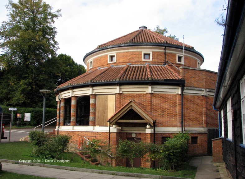
For various reasons, Britain has relatively few surviving Roman structures above ground, but the Verulamium Museum, shown below, is an impressive modern building based on Roman designs.

Verulamium Museum

Verulamium Museum

Inside the Verulamium Museum are a wide variety of artefacts discovered during the excavation of the city, including several building tiles that contain paw prints from cats and other animals that walked across them around 2000 years ago.

Animal Paw Prints on Roman Tiles, Verulamium

Animal Paw Prints on Roman Tiles, Verulamium

A cat paw print was also found on a Roman roof tile in Gloucestershire a couple of years ago, as described here.

During my visit to Verulamium, I bought a small but interesting book called Geometric Patterns from Roman Mosaics.

I’ve referred to this little book from time to time since then, whenever I’ve needed some explanation of the construction of Roman mosaics. It only struck me recently, however, that (as described in the book) most Roman mosaics are laid out in a rectangular matrix.

Over on my professional blog, I’ve written several articles about Bitmap Graphics, which are themselves based on rectangular matrices.

It really is an astonishing connection between ancient art and modern technology!

Sketching the Great Comedian

The Great Comedian, 1986

The Great Comedian, 1986

Back in the days when I used public transport to get to work, I found myself with a substantial amount of “down time”, spent waiting for transport or traveling on transport. I wanted to do something useful with that time, so, one summer, I decided to try to teach myself Classical Greek.

I had learned French (which was mandatory) and German (optional) at high school, but Greek wasn’t even offered at my school. I was inspired to try to learn the language by having read some of the surviving works of classical authors (in English). Unfortunately, many people seem to assume that all those works are heavy tomes of philosophy, or else harrowing tragedies, because that is frequently the false impression given in pop culture. In fact the range of surviving work is much greater.

They Really Are Old Jokes

I was most impressed by the surviving comedies of Aristophanes, who wrote his plays at around the time of the fall of Athens. Naturally, the theme of many of his plays involves the Peloponnesian War, and possible ways to bring it to an honorable end. Nonetheless, many aspects of his plays seem astonishingly modern, and even include the first recorded instances of what would now elicit groans as “old jokes”.

Isn’t it a Whimsical Francis?

Living in Britain in those days, the plays of Aristophanes naturally reminded me of the recent bawdy television comedy series, Up Pompeii, starring Frankie Howerd.

The basic premise of Up Pompeii, that of a cheeky Roman slave who managed the intrigues of his masters, had been inspired by an earlier stage play (which was later made into a movie), A Funny Thing Happened on the Way to the Forum. That play in its turn was derived from the Roman plays of Plautus.

My knowledge of Classical Greek never quite rose to the level of being able to read Aristophanes in the original, but it did inspire me to draw a sketch that was intended for eventual reworking as a painting. The sketch was titled “The Great Comedian”, and was supposed to depict an author whose appearance was inspired by (but deliberately not the same as) Frankie Howerd. I’m also aware that my drawing does not accurately depict an Ancient Greek man, since, for example, all adult males wore beards. A man who did not have a beard would have been thought of as very effeminate.

Learning Sketches

When trying to draw someone with a particular appearance, I find it helpful to do some initial sketches to “get a feel” for the anatomical structure of the person. This is a motor skill, and as such is an intuitive process, which I cannot explain in process terms, any more than you can explain the steps to learning how to catch a ball.

For “The Great Comedian”, I drew some sketches of Frankie Howerd. The drawing below shows him performing in the stage version of “A Funny Thing Happened on the Way to the Forum”.

Frankie Howerd in a Funny Thing Happened on the Way to the Forum

Frankie Howerd in a Funny Thing Happened on the Way to the Forum

On Show at the IEE

The pencil sketch of the Great Comedian, and his female partner, was as far as my project ever got. Nonetheless, my drawings were exhibited at an Art Show at a very unusual location: the Institution of Electrical Engineers (IEE), Savoy Place, London, in 1986. I was a member of the IEE at the time, but, having viewed the exhibits at the show, I was left with the feeling that they expected that the exhibits would be created by the spouses of their engineers. The notion that an engineer might himself be capable of producing competent artwork seemed never to have been considered a possibility.

Legacy of Greek

A hundred years ago or more, most British schoolboys were forced to learn Latin and Ancient Greek. (Most British girls at that time simply didn’t get any education beyond the age of twelve!) The “classics”, as they were called, were later pushed aside for subjects that were considered more modern and with more practical applications.

Personally, I felt that, even though I never became fluent in Classical Greek, learning it was a worthwhile endeavor. I learned the Greek alphabet, and came to appreciate not only the complexities of that ancient language, but also the amount that it has contributed to modern Western culture.

No Religion Please

I mentioned in a previous post that I’d had a “bellyful” of religious fairy tales from a Church of England school during my childhood, so the fact that the New Testament is written in a demotic form of Greek called koine was not a motivation for me to learn the language. Nonetheless, my knowledge of the language came in unexpectedly handy later on, when a Christian proselytizer falsely tried to claim that something in the Bible had been “mistranslated”. To his dismay, I was able to bring out a copy of the book in the original Greek, and demonstrate to him that he was either ignorant or lying!

Architectural Redevelopment: Vandalism or Progress?

St. Pancras International Station, London, 2010

St. Pancras International Station, London, 2010

In 2010, I visited a spectacularly transformed St. Pancras Station in London, for the first time since I had lived in the city. In the photograph (below) taken during a 1981 visit, St. Pancras was a dowdy, run-down relic, the only possible future for which seemed to be closure and demolition.

St. Pancras Station, 1981

St. Pancras Station, 1981

But, thankfully, it was not to be, partly due to the efforts of one man, and instead, the huge Victorian edifice was not only saved, but was transformed into the impressive, functional St. Pancras International Station. The photograph below shows the beautiful and airy interior of the trainshed of St. Pancras International, on a day when a German ICE train was visiting to promote future usage of the station by DB.

Interior of St. Pancras International Station, 2010

Interior of St. Pancras International Station, 2010

Although the redevelopment of St. Pancras is one of the most internationally famous triumphs of architectural rehabilitation, there have been many other examples of success and failure.

Yesterday, someone posted on the Facebook page of my alma mater, Imperial College, a photograph of the Imperial Institute, which was a predecessor building in South Kensington, the site of which is now occupied by Imperial College. That reminded me of the many heated battles that have occurred during my lifetime over architecture, and the demolition or redevelopment of buildings. In the past, the usual result was demolition, but, during the past twenty years or so, more enlightened thinking has prevailed, resulting in such wonderful renovations as St. Pancras.

During the 1960s (long before I became a university student), the Imperial Institute building was the focus of a heated dispute between those who wanted to demolish the Victorian edifice completely, and those who wanted to preserve it.

The redevelopers of the Imperial College campus wanted to sweep away all the Victorian architecture and replace it with what they considered to be modern and functional structures.

However, an organization called the Victorian Society, led by the poet Sir John Betjeman, fought for the preservation of Victorian architecture, and became particularly involved in the Imperial College plans. Although they were not able to save everything, the Victorian Society won a partial victory in that case, and managed to force the developers to retain the central tower of the Imperial Institute, which, as a freestanding building, was renamed the Queens Tower, as shown in my 1981 photograph below.

Queens Tower, Imperial College, in snow, 1981

Queens Tower, Imperial College, in snow, 1981

Now, whenever anyone needs a general photograph of “Imperial College”, you can be fairly certain that they’ll choose a view that includes the Queen’s Tower. The sad reality is that most of Imperial College’s modern architecture has very little character, and the Queen’s Tower has become a de facto icon of the college. (Incidentally, the tower is not the only pre-1960s architecture remaining on the Imperial College campus. For example, the original City & Guilds College building still survives on Prince Consort Road. However, that structure is relatively undistinguished and squat, as you can see in this current Google Streetview.)

I must admit that, while a student at Imperial College, I myself was responsible for heaping further derision on the Queens Tower. As part of a spoof Felix article about the stationing of US troops within Imperial College, I contributed the illustration below, showing how the Queen’s Tower was to be converted into a launch platform for cruise missiles! (“Felix” was and still is the Imperial College student newspaper, tracing its roots back to the days when H G Wells was a student at the college.)

Queens Tower Missile Installation, 1983

Queens Tower Missile Installation, 1983

Betjeman and the Victorian Society were also instrumental in frustrating plans for the demolition of St. Pancras Station, which preserved the building for its eventual renovation. Appropriately, Betjeman’s contribution has been commemorated with a statue of him on the platform at St. Pancras, as shown below.

Statue of Sir John Betjeman at St. Pancras International Station

Statue of Sir John Betjeman at St. Pancras International Station

Personally, I don’t regard “high Victorian” architecture as being the epitome of good taste, but surely it is preferable to characterless, badly-constructed concrete boxes that replaced so much of it.

In a previous post, I showed how the architecture of Scarborough Central Station was redeveloped from the simple neoclassical design of 1845, to the ornate high-Victorian “wedding cake” that still survives today.

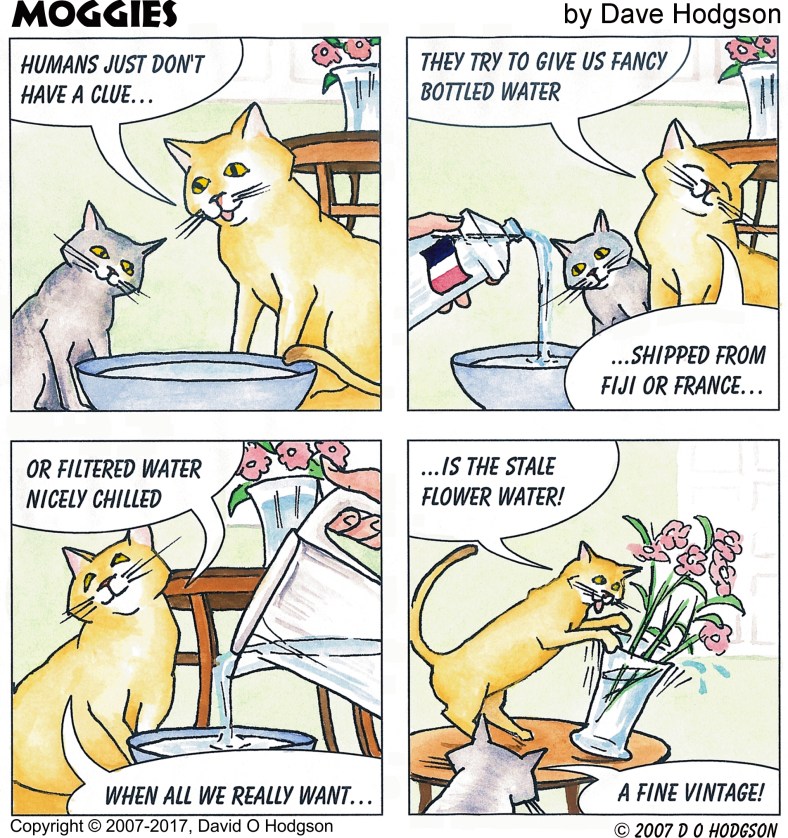
Moggies Cartoon: Pure Water

Moggies: Pure Water

Moggies: Pure Water

Here is the second Moggies cartoon, which I originally produced for display at Sonoma County Fair.

The theme of this strip seemed to ring a bell with many cat owners!

I already posted one of the three Moggies cartoons that I’ve produced to date. The third has an Independence Day theme, so I’ll post that closer to the actual day!

Tomorrow Never Knows

Stories of Mr Wolf, 1966

Stories of Mr Wolf, 1966

Last week, Mary and I went to see the movie of Scott Freiman’s lecture Tomorrow Never Knows: Deconstructing the Beatles (Revolver).

The Beatles created their famous album “Revolver” during the summer of 1966. I’m afraid that my artistic creations during that summer were less sophisticated, probably because I’d just turned six at the time. Above is an illustration from my 1966 book “Stories of Mr Wolf”. According to a date on the page, the drawing was created on Sunday, July 3rd of that year.

The stories turned out to be rather short, and much less psychedelic than the Beatles’ music! Mind you, they did involve talking wolves who visited Scarborough, so they could have been described as being “far out”…

I scanned the surviving contents of my 1966 book recently. As you can see, the paper is becoming extremely yellow, and it’s very fragile. Fifty more years from now, the whole thing will probably have turned to dust, but then so will I!

When I penned that drawing, back in July 1966, my father was the same age that I am now. Did I imagine then that, fifty years later, I’d be scanning my drawing into a digital image, then posting it on a publicly-networked page for all the world to see? Of course not! I wouldn’t even have known what those concepts were. That wasn’t just because I was only six years old at the time, since I’m sure that my parents would not have understood those concepts either. There were contemporary TV shows that attempted to predict what life would be like in the twenty-first century, such as Thunderbirds, but all of those shows completely missed the emergence of the internet. It really was a case of “Tomorrow Never Knows”…

The Colored Pencil Craze


Portrait in Colored Pencil

Portrait in Colored Pencil

I’ve been puzzled and amused by the recent fad for “Adult Coloring Books”. Apparently, the popularity of these books has led to a shortage of colored pencils to buy! (See for example this article.) As a result of using them at school, it took me many years to realize that colored pencils were not “just for kids”.

My school experiences with colored pencils led me to rather a cynical view of the results that could be obtained, because our teachers required us to use them, but didn’t teach us how to use them. From the teachers’ viewpoint, pencils were naturally preferable to paint, because they didn’t produce so much mess. The problem was that, because we were never taught appropriate techniques, most of the results were very poor.

My experiences with coloring books were also not positive! Relatives would sometimes buy me coloring books as presents when I was young, but I don’t recall ever using one. My view (which apparently went unconsidered) was, “Why would I want to color in someone else’s drawings, when I’m churning out my own drawings every day?”

Nonetheless, later on, in the 1980s, when I was studying Illustration at St. Martins School of Art in London, I invested a sizable sum in a set of 72 Derwent colored pencils (my “life savings”, as my instructor described it). Despite that, the only finished work that I ever produced solely with colored pencil was the portrait at the top of this post. I was quite pleased with the results, but found the technique very time-consuming.

Since then, I have sometimes used colored pencils for concept sketches, such as that below for a fictitious piece of jewelry.

Sketch of Fictitious Jewelry

Sketch of Fictitious Jewelry

I’ve also used pencils in “mixed-media” illustrations, but never as the only medium for a finished work.

There are some excellent artists who specialize in producing photo-realistic colored pencil art. I’m left in no doubt that colored pencil can produce excellent-quality art, but only very slowly!