
You Can Call Me Piet
The image above is my own work, but was inspired by “Composition C” created in 1935 by the Dutch artist Piet Mondrian. I’ve been learning more about Mondrian’s life recently (mostly from the book Piet Mondrian: Life and Work), in connection with some design work I’m doing.
You’ll notice that the only colors in my artwork, as in Mondrian’s Composition C, are the so-called “primaries”: red, blue and yellow. Mondrian seems to have become quite obsessed with these particular colors, and he asserted that they somehow exist as special entities in the universe.
Mondrian was part of a group of artists who called themselves neoplasticists, and they published a magazine called De Stijl. As mentioned on page 194 of the book cited above, in 1917, Mondrian claimed in an article in De Stijl that:
All colors are available to our perceptions, but only true colors are susceptible to objective definition. The primary colors, which form the basis for all natural visible colors, fulfill this requirement.
The problem is that the claim is false, because the illusion of primary colors stems entirely from the quirks of the human visual system. Thus, there are no “true colors” in nature that could form the basis of other colors. Colors of light fall into a continuous electromagnetic spectrum, in which no color is more “true” or “primary” than any other.
There are no “primary colors” in nature.
Primary Colors don’t Exist
Those of us who received some type of artistic training at school probably remember being told by our teachers that there are 3 “primary colors”—red, yellow, and blue—from which all other colors may be mixed.
In fact, the illusion that there 3 primary colors stems from the fact that there are 3 types of color receptor cell in our eyes. If instead, due to the vagaries of evolution, our eyes had 2 or 4 such types of cell, our teachers would be telling us that there are 2 or 4 “primary colors” respectively! [Addendum 7/19/23: In fact, a small number of humans do have 4 color receptors in their eyes. See https://www.healthline.com/health/tetrachromacy.]
An entire book (claimed to be the best-selling art book ever produced) has been written on the misunderstanding of the “artist’s primaries”: Blue and Yellow Don’t Make Green by Michael Wilcox. Oddly, though, that very detailed book never makes any attempt to describe the human visual system and its light receptors. Instead, the author explains color mixing effects in paints as the results of impurities in the pigments (which is also true—the pigments are impure).
The Physiology of Human Vision
In a post on my professional blog, I explain in more detail how humans see color, and how additive and subtractive color systems work. These physiological limitations are a key to the basis of many color reproduction technologies, such as television and halftone printing.
Although research continues today on the subject of vision, the fact that human eyes have several different types of light detector has been known since about the 1850s.
For the details, see my professional post, but to summarize here, the human eye has 3 types of receptors for colors (“cones”), plus one further type for monochrome vision (“rods”). Of the 3 types of cones, there is one type that is most sensitive to red light, another that is most sensitive to green light, and a third that is most sensitive to blue light. Each color of light corresponds to a wavelength in the electromagnetic spectrum.
In my diagram below, the sensitivity of the blue receptors is shown by the S (for “short”) curve, that of the green receptors by the M (for “Medium”) curve, and that of the red receptors by the L (for “Long”) curve. The R curve shows the sensitivity of the rod cells.
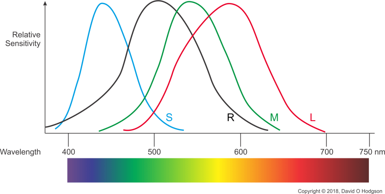
The Sensitivities of the Human Visual System
Light entering the eye may have any wavelength (i.e., any color) in the visible spectrum. Our brains determine the actual color by combining the intensities received by the three types of cone cell. For example, if yellow light enters our eyes, then the red and green cones see high intensities, while the blue cones see little intensity. The brain converts this information into the perception of yellow.
This means that our eyes can be fooled into seeing colors that are not actually present, by presenting combinations of other colors that trigger the receptors in the same way as the missing color. In fact, many display systems, such as color television, rely on this fact to create the illusion of continuous color from only 3 separate frequencies.
Artists’ so-called primaries are in fact the “subtractive primaries”, which are the complements of the “additive primaries” discerned by our eyes. The subtractive primary colors are more accurately named as magenta, yellow and cyan, respectively.
Primary Colors are in the Eyes of the Beholder
If you think a little about this situation, you can understand how the concept of “primary colors” arises. The fact that we see any color as being the combination of responses from 3 receptors gives the false impression that every color of light is somehow made up of proportions of 3 colors.
It may be disappointing to realize that, in the case of color vision, once again, we find that we don’t experience reality directly, but only a filtered version of it, due to the limitations of our senses.
Is it Art?
I should probably make it clear that I am not criticizing Mondrian’s artwork in this article, nor am I suggesting that he lacked artistic skills. The fact that he was misguided in his claims about primary colors does not detract from the quality of his artwork.
Personally, I was first introduced to Mondrian’s work as a teenager, during my Advanced-level Art studies. Our teacher showed us examples of his abstract work. While I don’t recall her ever explicitly saying so, I got the impression that we were supposed to conclude that it was not “real art”, but I do not agree with that conclusion.
Certainly, debates about the quality of Mondrian’s art did not prevent it from gaining popularity, even long after his death. During the 1960s, Yves Saint Laurent designed an entire fashion line using designs inspired by Mondrian’s abstract paintings.
Colors we Can’t See
One implication of the continuity of the electromagnetic spectrum is that there are many “colors” that the human eye cannot see, because they fall outside the range of the receptors in our eyes. One example of this, which caused me some consternation when taking photographs, was the rendition of some flower colors.
In Spring in Britain, woodland areas are often carpeted with beautiful displays of flowers called bluebells. As the name suggests, the appearance of the flowers is bright blue. However, whenever I took photos of such displays (and particularly with a film camera), the color in the photo always came out purplish; not at all the color that my eyes saw in the original scene. The (poor quality) film photo below, from 2001, shows the results.

Bluebells, as captured on Film
The reason for this apparent change of color is that the bluebells actually reflect ultraviolet light, which our eyes cannot see, but to which photographic film is sensitive.
Apparently, most humans cannot see the ultraviolet in this case; it isn’t just some color-blindness on my part. (I know I’m not color-blind, because I’ve been tested for it several times, such as when I applied for my apprenticeship at Ferranti.) If most people could see the ultraviolet wavelengths, then presumably the flowers would be called “purplebells”!
Modern digital cameras tend to give a more faithful rendition of the color, although it still seems too purple, as shown below in my photo dating from 2007.

Bluebells as captured by a Digital Camera
Projecting Our Limitations onto the Universe
Mondrian’s false beliefs in this case are characteristic of much metaphysical theorizing, of a type that also occurs very frequently in religious thinking.
The error is to take some limitation or evolutionary quirk that applies only to the human condition, and then extrapolate that by claiming that it is a “universal truth”.
As the saying goes, a little knowledge can be a dangerous thing!


 I took the photo above, showing the church of
