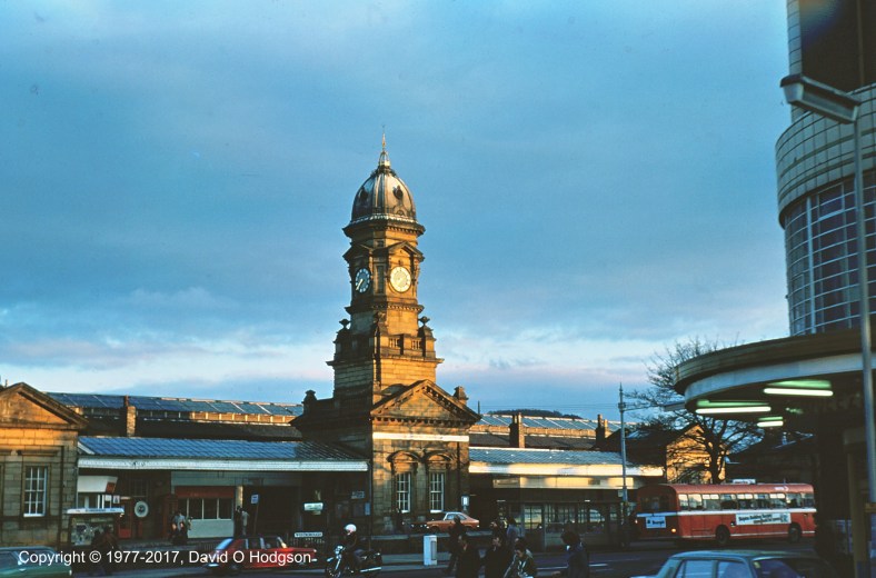
Scarborough Central Railway Station in 1977
During my teenage years, for my A-level Art study of architecture, I did some original research on the history of Scarborough [Central] Railway Station (shown above), which led to a surprising conclusion about the building’s original appearance.
My conclusions were questioned at the time, but were verified decades later by someone else’s chance discovery.
It was always a well-known fact that Scarborough’s main railway station was built in 1845 (quite early in the history of railways), at a location that was then outside the town limits. It’s also well-known that, in 1882, a central tower was added to the frontage. Surprisingly, and despite the efforts of various developers over the decades, the station building has survived to this day in essentially its 1882 form, as shown in my 1977 photograph at the top of this article.
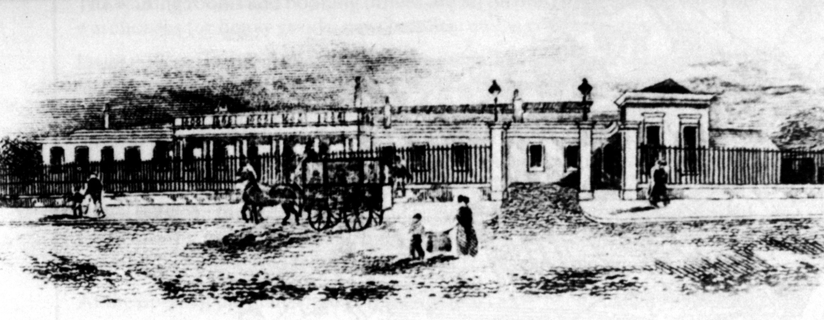
During my researches at Scarborough Reference Library, I discovered a copy of a catalog for an exhibition called “Marble Halls”, which had apparently taken place at the Victoria & Albert Museum in London in 1973.
Marble Halls
An 1844-dated illustration in the Marble Halls catalog showed a plan of “Scarborough Station” that, at first glance, looked nothing like the existing structure. The image below is the copy of the catalog illustration that I created for my study.

Copy of Plan of Scarborough Station, 1844
I hadn’t expected to see the central tower, of course, but where are the three small pavilions in the building’s frontage? The plan also shows a colonnaded central entrance, of which there’s no trace in the existing building.
My initial impression was that this plan did not represent the station as built, but I was puzzled that the accompanying commentary did not mention any discrepancy between the plan and the structure as-built.
I wrote to some local experts on the subject, who provided me with the limited historical references that were available. None of this provided any clear details regarding alterations to the building, except for the addition of the tower. The general opinion seemed to be that the entire frontage of Scarborough Station had probably been rebuilt in 1882 (rather than just the tower), but there was no evidence to prove that claim. One expert pointed out that the architect’s illustration in “Marble Halls” may have been nothing more than an “architect’s impression”, and that there was no guarantee that the station as-constructed had ever resembled that plan.
Some Detective Work
If in fact the building’s frontage had been substantially altered in 1882, it struck me that perhaps I could find some evidence of that (although it seemed odd that nobody would have previously noticed anything).
I walked around the outside of the building, examining its architectural details. I looked particularly at the locations that would be the junctions between the 1845 structure and what were potentially later alterations. Eventually, at the East end of the joint between the easternmost pavilion and the main trainshed (on the far left in the heading photo), I found a mismatch in the details of the pediment, as shown in my sketch below.

Scarborough Station. Detail of Trainshed Pediment stonework
The mismatched joint shown above would have occurred where the new pavilion was added to the main wall of the original building, if my suspicions about the station’s original appearance were correct.
Given the immense precision of the building’s stone carving, it seemed impossible that such a noticeable mismatch would have occurred (or be allowed to remain) during the original construction. It seemed much more likely that this mismatch occurred because of some miscalculation when new stone was carved later, the intention having been to match the details of the original building.
Conclusion & Confirmation
In my study, I presented my conclusion that the 1844 architectural plan did indeed show the original appearance of Scarborough station, but that the building had been subject to greater subsequent alteration in the 1880s than most people had suspected. Not only was the central tower added, but most of the original frontage had been removed, and replaced with the three small pavilions that still exist.
At the time, I had no evidence to support my assertion, except for the architectural plan and my own illustrations of the architectural details of the actual building. Thus, my conclusion remained unproven, and nothing more than an “interesting speculation”.
In 1995, long after the completion of my Art A-level, and by which time I’d moved away from Scarborough, first to London and then to California, one of my expert correspondents from 1977, J R Lidster, published his own book on Scarborough Railway Station. In that book, he included a drawing of the station frontage from a letterhead that had recently been discovered in the attic of a property in Scarborough.
Sure enough, the letterhead showed a building that closely matched that depicted in the 1844 plan in the book “Marble Halls”, thus finally verifying the conclusion of my investigation.
[Added 12/14/24] Here is the letterhead described above, from J R Lidster’s book:
Early View of Scarborough Railway Station. Copyright J R Lidster
A Sense of History
At the age of thirteen, I was forced to select a restricted range of subjects at school for continued study, as preparation for taking “O-level” examinations. One of the subjects that I dropped was history, because my naïve belief at that time was that history was “already written down”, and thus there was nothing new to add. Even at that age, I knew that, whatever I was going to devote my life to, I wanted it to be something innovative.
The experience that I described above, where I was able to provide original insight into a historical problem, showed me that my earlier view of history had been wrong. The events under consideration were, after all, relatively recent history, dating back only about one century, and yet many details were unrecorded, and there were new contributions to be made. I was able to offer new information without even “getting my hands dirty”!
Postscript: More Marble Halls
This incident was my first encounter with the contents of the “Marble Halls” catalog. The book also contains illustrations of other Victorian buildings that featured in my later life. For example, there’s an illustration of the Imperial Institute in London, the buildings of which were subsequently incorporated into Imperial College, from where I would graduate.
The book also includes an image of Highclere Castle, in Hampshire, which was close to my home in Andover in later years. Highclere Castle is now world-famous as the fictitious Downton Abbey.


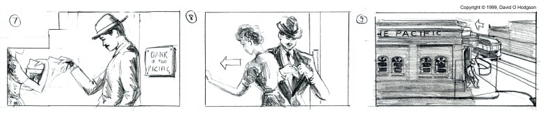


 All our Yuletide cards are on the way to their recipients, as of this morning.
 I just posted a new tutorial to my professional blog:
 I just completed some artwork to illustrate a forthcoming article for my professional blog,