Unrecognized Qualifications, Missing Expertise & Horizon

One part of my drawing of Thornton Dale Station

The drawing above, of Thorton Dale Railway Station, (reproduced much smaller than life-size here) was the most ambitious of the architectural views that I created for my Advanced-level Art project during 1977-78. I’ve also posted this drawing on a page about the subject – Thornton Dale railway station – along with several photos that I took, and sketches that I made, at the same time.

Not Part of the Syllabus

I realize that some of the illustrations that I’ve been reproducing in this blog from my Art study (such as this and this) may give the impression that architectural drawing skills were taught as an element in the A-level course. In fact, nothing could be further from the truth. My expertise in such drawing techniques derived entirely from an O-level in Geometric Drawing that I had completed at the Graham School a few years previously. During the two years of the A-level course, I don’t recall ever having been taught anything about architectural illustration!

A few years later, when I commenced my Student Apprenticeship at Ferranti, I naturally assumed that my Geometric Drawing O-level should count towards my training, but no! We were required to learn technical drawing as part of the IEE-prescribed EP1 training, but no credit was given for prior expertise in the subject.

Of course, the fact that I’d obtained an O-level in the subject did make the Ferranti training much easier to complete, so my prior qualification was useful in that sense.

My Drawing of a Bristol Lodekka Bus; produced for the A-level Study but not used

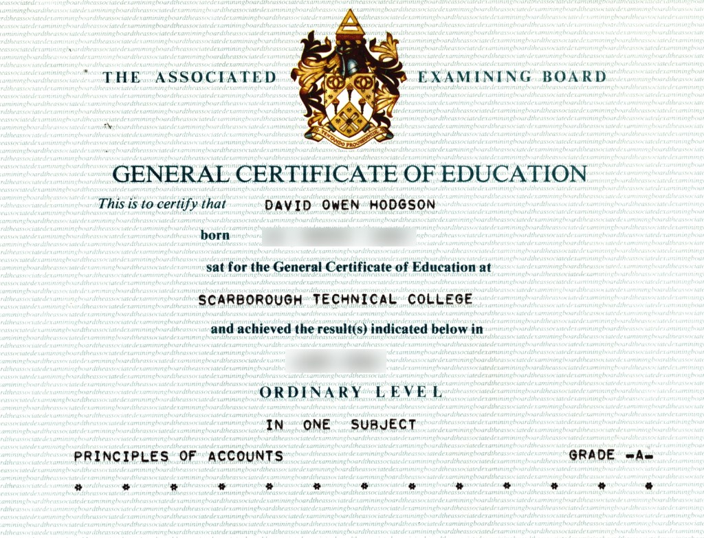
O-Level Principles of Accounting

Here is another example of a qualification that I obtained, and which was useful, but was not recognized by professional bodies. As I’ve described in another post, prior to joining Ferranti, I had worked for about 18 months as a Purchase Accounts and Sales clerk at the light engineering company Swift’s of Scarborough.

Soon after my employment commenced, my manager suggested that I might consider obtaining an Ordinary-level qualification in Accounting. It seemed as though that would help me do my job better, so I started a course at the Scarborough Technical College (now Scarborough TEC). I sat the exam and easily obtained the O-level in 1980. There was some suggestion that I should continue by taking an Advanced level qualification in the same subject, but, by that time, I had concluded that my time would better be spent studying to return to university. I already had more than sufficient O- and A-levels to qualify for university entry, so why add another one?

Part of the Certificate for my O-level in Principles of Accounts

Useful in my Job

There’s no question that what I learned from the O-level course did prove useful in the execution of my duties at Swift’s. Perhaps the most basic principle instilled into us by the course was the concept of double-entry bookkeeping; a simple idea but a powerful and necessary one. The only problem with the O-level qualification was that it was not professionally recognized in any way; had I wanted to become a Chartered Accountant, my O-level would not have been considered as a contributing qualification.

That leads to a seemingly-obvious question: Why didn’t Swifts encourage us to get recognized professional qualifications? At the time, I suspected that the cause may have been my manager’s lack of such qualifications; he had only an A-level in Accounting, and that also was not recognized professionally. Presumably, he would not have liked the idea of his subordinate becoming more qualified than he was! With the benefit of hindsight, however, I suspect that the real cause had more to do with the inherent sexism of the time and place. The underlying assumption of Swift’s management was that whoever they hired for any Accounts Clerk position would be a young woman, with a few O-levels, and perhaps a couple of A-levels. The young woman could be expected to work at Swift’s only for a few years before getting married, at which point (they assumed) she would leave employment forever to become a housewife and raise children. As such, presumably Swift’s management saw no point in expending time and money on professional training for a career that their employees would probably never have.

Of course, in a more competitive employment environment, Swift’s would probably have been forced to offer proper professional training, to attract candidates with sufficient intelligence for the job. However, the sad reality was that there were so few opportunities for intelligent young people in the Scarborough area that they didn’t need to.

Useful at University

Having left Swift’s, and embarked on my degree course in Electronics at Imperial College, London, I discovered that we were encouraged to take non-engineering courses such as Accounting & Finance, Macroeconomics, etc. Again, the fact that I’d obtained the Principles of Accounting O-level made my Imperial College studies in Accounting & Finance much easier to grasp, so the knowledge I’d gained did come in useful again, even if it was not professionally recognized. My results in the Accounting & Finance course counted towards my final degree grades.

They still don’t seem to get it

More recently, it has seemed to me that, at the very least, Ordinary-level Principles of Accounting would have been a beneficial subject for study by those who designed the Horizon software for the British Post Office!

As the forensic accountant investigating that scandalous failure reported, the software violated basic principles of double-entry bookkeeping, such that, even if the code had been well implemented (which it was not), the system was bound to fail quite quickly.

Can it be that not one of the technical contributors to the Horizon software system had even an O-level in Principles of Accounts? If so, then how could a major national institution such as the Post Office ever have believed that the resulting system would be trustworthy as a key component of their accounting systems? I don’t know the answers to those questions, but they would certainly seem to be worthy of investigation!

Living in Brutalist Britain

Linstead Hall, Imperial College, London, from my residence in Southside Halls

A few weeks ago, my wife and I went to see the movie The Brutalist. The extent of the hype for this movie was truly breathtaking, which may be partly why I was not surprised that it did not live up to its “promise”.

I must admit that media coverage led me to question whether those who were singing its praises even understood anything about the movie’s subject matter! For example, a fawning item about it on ABC News included paroxysms of praise for the movie’s stars and director, but never actually mentioned what the movie is about, nor was there any explanation of what the title “Brutalist” referred to! I guessed that it must have something to do with Brutalist Architecture, and it turned out that I was correct, but that was no thanks to ABC. Did the presenters really not understand it themselves, or had they decided that the explanation was too “intellectual” for their audience?

Perhaps that is, in fact, the key to the praise that the movie has received. It seems that the less a reviewer knows about its subject, the more they like the movie. Those who do understand its subject matter, professional architects, have been highly critical of its blunders and implausibility, to the extent that they are described as “hating” it in this article.

I also thought that, given its thin, questionable plot and appalling examples of ignorance, the movie was much too long at 3 hours, 35 minutes. As the Guardian reviewer states sarcastically:

“The architecture world awaits with bated breath the director’s five-hour marathons, The Postmodernist, The Deconstructivist, and The Parametricist – each to be shot with period-appropriate equipment and based on a brief skim through a coffee-table book”

Personally, the only benefit that I obtained from the movie experience was that it prompted me to think once again about the real Brutalist architecture that I grew up in and around, the history of which I find infinitely more interesting than any aspect of the movie.

Growing up, Brutalist architecture was a constant background theme in my life, and I even lived in one example of it for a while.

Brutal Aylesbury

I never actually lived in the Buckinghamshire county town of Aylesbury, but, as I recounted in a previous post, my first visit there involved a job interview and a “computer programming aptitude test” that had a profound effect on my view of my own abilities in that field.

During the period from the 1930s to the 1970s, the British Government made major investments in a group of what were referred to as London Overspill Towns. There was a deliberate policy of moving population en masse out of London, to more rural locations. The goal was mainly to reduce further “ribbon development” of the London suburbs, which would eventually have spread across the entire South-East of England. There were also health implications, since prior to the 1960s, London’s air was seriously polluted, leading to increased healthcare costs.

During the 1960s, various existing towns were targeted for substantial redevelopment and expansion, and a few entirely new towns were created. Most of these were within commuting distance of London, but even Grantham in the East Midlands was included.

The map below is from the 1963 book New Architecture of London.

Map of London Expansion Towns. Copyright © 1963, British Travel and Holidays Association

As shown, one of the “expansion towns” was Aylesbury, which had until then been a quaint market town, famous mostly for its ducks.

Development plans for expansion towns invariably included the construction of new shopping centers and civic buildings, and some of these were designed along brutalist architectural lines. In 1967, Aylesbury found itself lumbered with a new shopping center, Friars Square, which quickly came to be seen as such an outstanding example of a dystopian nightmare environment that, in 1971, scenes for the movie Clockwork Orange were filmed there!

My 1980 photo below shows the centerpiece of Friars Square, the Cadena Cafe, after it had become a Wimpy Bar. As with many examples of brutalism, the building had a relatively short life, being demolished in 1993 when the shopping center was redeveloped.

Friars Square & Cadena Cafe, Aylesbury

Elain Harwood’s book Brutalist Britain offers an extensive listing of brutalist architecture in the country, and describes another Aylesbury example, the Buckinghamshire County Council office tower.

The cover of Brutalist Britain, Copyright © 2023, Elain Harwood, Batsford Publishers

My 1980 photo below shows the County Council tower looming above Market Square in Aylesbury, with the Bell Hotel in the foreground.

The Bell Hotel, Aylesbury, with the Buckinghamshire County Offices beyond, in 1980

Brutal Birmingham

Birmingham New Street Signal Box, 1980

It seems perhaps most appropriate that Brutalist architecture would be chosen for the design of industrial buildings, and even British Railways constructed a few examples. One of the most famous in Britain must surely be Birmingham New Street Signal Box, which has towered above the gloomy subterranean station since 1966, and is clearly visible from street level, as shown in my 1980 photo above. Although it closed as a signal box in 2022, the building is listed, is still standing, and continues to be used by Network Rail.

Again, Birmingham was not a city in which I ever lived, but when traveling between Coventry and York, I usually had to change trains at Birmingham New Street. I also applied to, and was accepted by, Aston University in Birmingham, so I attended an interview there in 1980.

Brutal London

Approximately a year after visiting Aylesbury for that job interview, I found myself moving to London, as I began my Electronic Engineering studies at Imperial College.

Many first-year undergraduate students were accommodated in Halls of Residence, situated in South Kensington near the college campus. Generally, we were assigned to one of the halls, and were not given any option as to which hall we preferred. I was assigned a single-bed room in Selkirk Hall, which was a subdivision of the huge Southside Halls building, located, as the name indicates, on the south side of Prince’s Gardens.

The photo at the head of this article shows the view looking north from Selkirk Hall over Princes Gardens, one stormy afternoon. The building in the foreground is Linstead Hall, which was of similar architectural style to Southside. In the distance, the tower of another Brutalist edifice is visible; Hyde Park Barracks, which was and still is the home of the Horse Guards.

Cover of Lost Futures. Copyright © 2017, Owen Hopkins, Royal Academy of Arts

Unfortunately, while living in Selkirk Hall, I never photographed the outside of the building itself (partly because the trees in front of it obscured most of it). However, Owen Hopkins’ book Lost Futures includes an article about Southside Halls, which also mentions the smaller Weeks Hall, situated on the north side of Prince’s Gardens.

The photo below, borrowed from “Lost Futures”, shows an excellent panorama of Southside, before the trees in front of it grew too large.

Southside Halls, Imperial College. Copyright © 2017, Owen Hopkins, Royal Academy of Arts

Unfortunately (or perhaps fortunately, depending on your view of their aesthetics!), the passage of time has revealed that many Brutalist buildings were not well-constructed, and in some cases not even well-designed. I had personal experience of this while living in Selkirk Hall.

I lived in the building for only one academic year, but even during that time there were serious maintenance problems. Each bedroom had its own sink, whereas kitchen and bath facilities were shared. The sink in my room was out-of-action, and boarded off, for several weeks during my residency, due to plumbing problems. It seems that the design of the building had a major flaw, whereby pipes and other service conduits were buried directly within the concrete, instead of being placed in accessible service ducts. As a result, any plumbing maintenance work required drilling out the concrete to access the pipes! The quality of the concrete also seems to have been defective, and large chunks of it eventually began to disintegrate.

The upkeep of Southside became so problematic that, despite its being a listed building, permission was eventually granted to demolish it in 2005. That permission was granted on condition that the smaller Weeks Hall, on the north side of Prince’s Gardens, and also a listed building, be retained and refurbished. In my photo below, looking north from Southside, you can just see Weeks Hall towards the right.

Skyline from Princes Gardens, with Weeks Hall

One of the more successful examples of Brutalist architecture, which still exists and is in use today, is the Barbican Centre, in the City of London. My photo below shows part of the complex shortly after its official opening in 1982. I visited the Centre many times, usually to go to the Museum of London, which was housed within it.

Despite having been voted the “Ugliest Building in London”, the Barbican apparently remains popular with apartment renters, thanks to its views and convenient location.

Barbican Centre, London

Brutal Scarborough

Even my home town of Scarborough suffered the attentions of architects with brutalist leanings. In 1973, the imposing Pavilion Hotel, immediately opposite the main railway station, was controversially demolished and eventually replaced by an office block that has been described as the “ugliest building in Scarborough”. I reproduce below an article from the Scarborough Mercury of 15th September 1973, showing how the new building was to look, along with hopelessly-optimistic predictions of its future uses.

Scarborough Mercury article about Pavilion House. Copyright © 1973, Scarborough News

The building did eventually gain one supermarket, on the ground floor, although, as I recall, that store managed to look run-down from the day it was opened! As regards actual other uses for the new building, I can only remember it as the home of Scarborough Job Centre, in which I spent many useless hours not finding a worthwhile job. It seems perhaps appropriate; a depressing and ugly location for a depressing and hopeless office!

There’s no question that, whatever the aesthetic qualities of those Brutalist buildings, they were and are each unique, and they formed a memorable backdrop to my life in those days.

The POW Artists of Changi

Fred Binns in Changi Gaol

My mother’s first husband, Fred Binns, in Changi Gaol, 1943

The painting above depicts my mother’s first husband, Fred Binns, as a Japanese Prisoner-Of-War (POW) in Changi Prison, Singapore, in April 1943. It’s quite astonishing that this painting not only survived Fred’s imprisonment and subsequent liberation, but also that it was inherited from Fred by my mother, and then passed down to me from her.

If the painting could speak, it would surely tell a harrowing tale, of how it was perhaps painted using strips of bamboo and human hair, using tints mixed from different soils, then hidden from confiscation by being placed under the corpses of cholera victims. Despite all that horror, it depicts a joyous scene, showing Fred enthusiastically playing the double bass. If the proportions of the bass seem odd, that’s not due to any lack of skill on the part of the artist. That was in fact the appearance of the real instrument, because Fred had built it himself from scrap wood.

Changi Prison seems to have housed an astonishing concentration of creative talent. As shown above, Fred was himself a keen amateur musician, but there were also many artists in the prison.

Sadly, despite having survived all the horrors of imprisonment in Singapore for 4 years, Fred died prematurely of tuberculosis in 1949. He had contracted what was then usually a fatal disease during his internment, but was not aware of it at the time. By the time he died, he had married my mother, and she caught the disease from him. She was admitted to the ominously-named Killingbeck Sanatorium, and it was only thanks to the development of new “wonder drugs” that she survived at all. Her curative treatment was long and unpleasant, involving the complete collapse of each lung in turn, to rid it of the disease. Nonetheless, she survived the hideous disease that had killed her husband, and was able to resume a healthy life, which eventually included marrying my father and giving birth to me!

Ronald Searle, Des Bettany & Fred Binns

Perhaps the most famous of Fred’s bunkmates in Changi was the artist Ronald Searle. My mother knew that this painting of Fred was not by Searle, but we were not able to identify the actual artist. There is a signature in the corner, but it was too smudged to be readable.

Recently, while researching for this article, I viewed images of artwork by other Changi prisoners via the internet, and was able to match the style, and the color palette, to a man called Des Bettany. Now that I’ve seen Bettany’s signature, it matches that on the painting, so I have finally established the identity of the artist who painted Fred.

Des Bettany went on to have a successful career as a cartoonist, and eventually migrated to Australia, where he taught art, eventually rising to become Acting Principal at the South Australian School of Art in Adelaide.

The Heyday of St Trinians

Searle is probably most famous for having created the fictitious girls’ school St. Trinian’s. The drawing below is the first-ever published “St. Trinian’s” cartoon, although the caption reveals that the girls shown are pupils of an anonymous opposing school.

Searle's First St. Trinian's Cartoon

The first St. Trinian’s cartoon by Ronald Searle, 1941. Copyright © Estate of Ronald Searle

Searle had drawn the cartoon before leaving England, but it wasn’t actually published until late 1941, when Searle saw it in Lilliput magazine while fighting on the streets of Singapore!

Although Searle’s invention of St. Trinian’s predated his wartime experiences, he did use some of those cruel experiences as inspiration for his subsequent cartoons. For example, there is a St. Trinian’s cartoon titled “Bloody Sportsdays…”, which depicts the girls being forced to pull a roller to flatten grass. This was adapted from Searle’s wartime sketch “Light Duties for Sick Men”, which showed prisoners being forced to haul trees for land-clearing, during 1944.

By the early 1950s, the St. Trinians’ cartoons had become so popular that they became the basis for a series of movies (The Belles of St. Trinian’s, Blue Murder at St Trinian’s, The Pure Hell of St Trinian’s, and The Great St Trinian’s Train Robbery). In most of the movies, the headmistress of the school (Miss Fritton) is played by Alastair Sim, who also plays the headmistress’ brother! One of my favorite Sim quotations from the first movie sums up the ethos of the school:

In other schools girls are sent out quite unprepared into a merciless world, but when our girls leave here, it is the merciless world which has to be prepared.

Even in modern times, movies in the St. Trinian’s genre continue to be produced, although it must be said that the themes seem increasingly anachronistic.

The image below shows the publicity poster for the latest St. Trinian’s movie, The Legend of Fritton’s Gold (2009). Incidentally, the actor in the center, who played head girl Annabelle Fritton in the movie, is Talulah Riley, who is in reality the ex-wife of entrepreneur Elon Musk.

[Postscript 8/15/20: What a coincidence. I just discovered that Talulah Riley’s grandfather was also at Changi, as she mentions in this Twitter post: https://twitter.com/TalulahRiley/status/1294569052258664451]

Poster for Movie: The Legend of Fritton's Gold

Publicity Poster for the Movie: The Legend of Fritton’s Gold

If you are interested in more details of Ronald Searle’s life, there is an excellent biography by Russell Davies. Further details of Des Bettany’s life can be found here. For details of the life of Fred Binns, however, I’m afraid that it seems you’ll have to rely on me!

I feel truly privileged to have inherited such a unique and wonderful piece of artwork, but also very glad that I never had to endure any of the horrors that led to its creation!

For more details of the POW artists in Changi, see changipowart.com. [Update 11/20/20: Des Bettany’s son, Keith, asked me for permission to post the artwork on the Changi POW web site, and of course I granted that. The page can be viewed at: https://changipowart.com/archives/5882].

Fred Binns in Changi Gaol

My mother’s first husband, Fred Binns, in Changi Gaol, 1943

Pallab and the Wide-Mouthed Frog

As I described in an earlier post, I first met Pallab Ghosh when we were both undergraduates at Imperial College, London. Pallab later went on to have a distinguished career in science journalism, becoming a major BBC Science Correspondent.

In 1983, Pallab asked me to create a fantasy portrait of him, to be used as a poster for his campaign for election as Editor of the Imperial College student newspaper, Felix. My portrait of him is reproduced again below. Pallab duly won that election.

Pallab Ghosh as "Super-Ed" (Superman)

Pallab Ghosh as “Super-Ed” (Superman)

Even before becoming Editor of the student newspaper, Pallab had gained a reputation in the college for telling one particular joke, “The Wide-Mouthed Frog”. He didn’t create the joke, which was already in circulation when I was at school, but there was something about “the way he told it”!

Recently, I unearthed a VHS videotape that was an off-air recording of one of the news shows broadcast by Student Television of Imperial College (STOIC). This edition included an interview that I had just recorded with Pallab in the TV studio.

I apologise here for the poor video quality of the clip, and for the crude jump-cut. In the early part of the interview, we discussed Pallab’s predecessor as Felix Editor, and his plans for the publication, which are unlikely to be of much interest after all this time! Thus I removed those portions of the recording.


2018 Yuletide Cards are On the Way

Winter Woodpecker: Ink & Watercolor

Winter Woodpecker: Ink & Watercolor

As of today, all our Yuletide cards are on the way to their recipients (or at least they will be when the USPS picks them up tomorrow!). My artwork for the card design is shown above. Naturally, the copyright notice does not appear on the card itself; it is included here only so that my artwork does not mysteriously become someone else’s design without my permission!

Mary and I discussed whether a Woodpecker was a “seasonal” bird, then we discovered that the USPS had already issued a set of stamps called “Winter Birds”, which included a woodpecker (albeit not a Downy Woodpecker)!


Yuletide Label Artwork for 2018

Seasonal Woodpeckers

Seasonal Woodpeckers

The image above is artwork that I just completed for the return labels on our 2018 Yuletide cards. As you can see, this year we’re going to have a “Downy Woodpecker” theme!

As with last year’s artwork (seen here), I used Corel Draw to create it. I should perhaps explain that, when it appears on the actual labels, the drawing is much reduced in size (less than one inch wide), so there’s no point in adding too much detail to it.

I had already created the main card artwork before I started working on this label graphic, to ensure that the card design would be sent to the printer as early as possible! I’ll post that artwork on my blog as soon as we send out the cards, which hopefully will be during this week.

I must admit that my own photographs of Downy Woodpeckers are not very good at all, because the birds have a frustrating habit of hiding around the back of the tree just when I’m ready to take the picture, as shown below.

A Shy Downy Woodpecker

A Shy Downy Woodpecker

Fortunately, I have several books describing California birds, and the internet is a rich source of reference photos, so it wasn’t too difficult to find images that are more helpful than mine!

[Update 12/9/18: After reducing the size of the artwork to fit the return labels, I noticed that the stylized tree in the center was unrecognizable. Therefore, I adapted the design to show a stylized cracker. I realize that many outside the UK may not be familiar with crackers, but it is more seasonal! Naturally, the artwork on the labels does not include the copyright notices.]

Seasonal Woodpeckers

Seasonal Woodpeckers

The Tower by the Bay

The Tower by the Bay, 1976

The Tower by the Bay, 1976

I completed the painting above during 1976, but not at school. I apologize for the poor quality; not only has the poster paint I used decayed over time, but the painting was also folded into four at some point!

The scene depicted is completely imaginary, and doesn’t attempt to represent any real place. I’m not sure why I chose to do this particular work at home; perhaps I just felt that my schoolteachers would demand to know what it was supposed to represent, and I wouldn’t be able to explain!

Today (October 25th) is International Artist Day, so I thought it appropriate to feature some of my artwork in this post, even if it’s not of “professional” standard on this occasion.

If my painting above represents anything, then I suppose that it was intended to show my “ideal location”, from my viewpoint as a teenager. Looking closely, the “tower block” in the image has a sign on the side saying “Europa”, so presumably it was supposed to be a hotel somewhere in Europe. At that age, I had no experience of independent living, so it probably seemed to me that the only alternative to living with my parents was to stay in a hotel!

The city on the horizon, with its illuminated seaside promenade, is of course loosely based on views of my home town of Scarborough (as shown below in my 1977 photo). However, at that time, there were no modern “tower blocks” such as the one in my painting near the sea in Scarborough (although there was such a building—Ebor House—in the nearby resort of Bridlington, which was in the news just recently for the wrong reasons).

Scarborough South Bay at Night, 1977

Scarborough South Bay at Night, 1977

I seem to have spent a lot of time detailing the interiors of the rooms in the hotel, which I could have avoided simply by painting the curtains closed!

Slightly more than ten years after I painted the image above, I unexpectedly found myself in a seaside location that reminded me of that imaginary scene, although it was not anywhere in Europe.

Realizing the Dream

The photo below, which I took during my first visit to California in October 1987, shows the Metro Tower in Foster City, as seen from one of the lagoon bridges. At that time, the Metro Tower, which had only just been completed, had the distinction of being the tallest building between San Francisco and Los Angeles.

Foster City, California, in 1987

Foster City, California, in 1987

During the first evening that I arrived in California, I found myself very disoriented, because I thought that the tower and lagoon in front of it were facing westwards towards the Pacific Ocean. In fact, Foster City faces San Francisco Bay, and thus eastwards. I had to consult maps to figure out why the sea seemed to be on both sides!

I’m afraid that once again the picture quality is very poor, but I could not in fact go back and take the same photograph today, because other large buildings now surround the Metro Tower, as shown in the nearest-available Google Street View today.

As I mentioned in a previous post, after emigrating to California later in 1987, I did rent an apartment in Foster City, and lived there for about 18 months. It was a pleasant place to live, and the sheer modernity of the surroundings was a refreshing change from everywhere that I’d previously lived.

Not a Premonition

I realize that, in view of what happened to me later on, it’s possible to interpret my teenage painting as some kind of “premonition” regarding the place where I would find myself living as an adult (and someone did in fact suggest that).

However, in general I see no evidence that premonitions, in the sense of someone being able to know what will happen in the future, are possible (if only because the future of the universe is inherently not knowable). You may be able to make a very good guess as to what will happen in the future, based on the current circumstances, but it’s only ever a prediction. (This is, of course, exactly what weather forecasters do every day.)

In the case of my painting, I think the reality is just the opposite. Having unexpectedly found myself in California, Foster City particularly appealed to me because it was so reminiscent of the scene in my earlier painting. Thus, I took action to fulfill aspects of the fantasy that I’d had as a teenager, and made it real.

In fact, seeing it that way seems better than believing in some kind of premonition, because I was able to take action to change my life in the way that I wanted it to be, rather than accepting whatever situation I found myself born into.

The Tower by the Bay, 1976

The Tower by the Bay, 1976

Flying North Again

Tatra T87 at the Minneapolis Institute of Art

Tatra T87 at the Minneapolis Institute of Art

The photo above shows a preserved Tatra T87 automobile, which, in my opinion, must surely be the ultimate “Art Deco Car”. Designed in Czechoslovakia in 1936, this particular example was built in 1948. The swooping lines and graceful curves of the design are highlighted in this case by the gleaming silver paintwork.

I’d have expected to find a car such as this on display in a prestigious European motor museum, so I was quite astonished this week when I visited the Minneapolis Institute of Art, in the Midwest of the USA, and found it there.

The reason for my visit to Minneapolis was simply because that’s my wife’s hometown. We went there to visit her family, most of who still live in or around that city. We had a great visit with everyone, but I must confess that, as I get older, I increasingly prefer the comforts of my home, so I was glad to get back!

Far Away is Close at Hand in Models of Elsewhere

Many years ago, during the 1970s, there was a famous item of graffiti that appeared near the approach to Paddington railway station in London, which ran:

FAR AWAY IS CLOSE AT HAND IN IMAGES OF ELSEWHERE

The first inkling that I ever had that there existed a place called the “Midwest” was when I was about 7 years old. In 1967, the Trans-World Model Railway opened at the Corner Café in Scarborough. This was a gigantic OO/HO scale model railway, which included inter-connected sections depicting Britain, France, Germany, and, via an “Atlantic Bridge”, the USA and Canada.

One of the US sections was captioned “The Midwest”, but of course I had no real idea where it was, nor did I ever expect to visit such a place, and I certainly never imagined that I might one day marry someone from there!

Having been married to Mary for some 27 years now, I’ve traveled with her to Minnesota on many occasions. We try to visit different places during each visit.

The Inland Beaches

As you might guess, the Midwest is far from either the Atlantic or Pacific Oceans, so there’s no ocean frontage to be found there. Nonetheless, given that Minnesota is the “Land of 10,000 Lakes”, there are still beaches within the state. The photo below shows one: Thomas Beach, on Lake Calhoun in Minneapolis, with the skyscrapers of downtown visible in the distance.

Thomas Beach & Downtown Minneapolis

Thomas Beach & Downtown Minneapolis

As a girl, my wife lived in an apartment that’s behind the trees on the far side of the lake, and she used to swim at this beach.

A Cultural Center

I realize that the Midwest may not generally be thought of as a center of culture, but in fact (probably thanks to its industrial wealth) Minneapolis has more than its “fair share” of cultural attractions.

In the past, I’ve visited the Walker Art Center, and various local museums, but I’d never before been to the vast Minneapolis Institute of Art. Hanging above the lobby of the Institute is a large glass sculpture by Dale Chihuly, as shown below.

Dale Chihuly Exhibit, Minneapolis Institute of Art

Dale Chihuly Exhibit, Minneapolis Institute of Art

Inside the Institute, many substantial collections are on display, covering all time periods from the Stone Age to the present, and spanning all continents.

Amid the collection of Twentieth Century artwork, there’s one painting by Piet Mondrian, whose art and beliefs I discussed in an earlier post. The photo below shows a closeup of his initials at the bottom left of the painting, to prove that it’s really his, rather than some simulation that I cobbled together on my computer!

Mondrian's Initials

Mondrian’s Initials

There’s also a large collection of Impressionist works, three of which are shown below. The painting on the left, Notre Dame de Paris by Maximilien Luce, sold in 2011 for $4.2 million, a record amount for an Impressionist work.

Some Impressionist Works

Some Impressionist Works

It’s impossible to do justice to the scale of the Institute’s collections in this short article, and I would encourage you to visit this amazing museum yourself if you’re ever in the vicinity.

The Scandinavian Diaspora

Many of the early European settlers in what’s now Minnesota came from the Scandinavian countries; Denmark, Sweden and Norway. Apparently, circa 1900, about 25% of the population of Minneapolis consisted of Swedish emigrés. Thus, it’s perhaps not surprising that Minneapolis is home to the American Swedish Institute. We visited this Institute too, and took the tour of the Turnblad Mansion, which was built in 1908 by the proprietor of a Swedish-language newspaper. The mansion is shown in the photo below, seen from inside the modern extension built next to it.

The American Swedish Institute

The American Swedish Institute

The ASI also has an excellent restaurant, FIKA, but it’s an understandably popular lunch venue, so you may have to wait for a table!

Flying Home

We returned to San Francisco airport directly from Minneapolis. I took the emotive photo below from my seat, as our Boeing 737-800 was descending to land in San Francisco. Our flight left Minneapolis at about 6.30pm, so we were “chasing the sunset” back to California as shown in the photo.

Boeing 737-800 Landing at Sunset

Boeing 737-800 Landing at Sunset

The circumstances of my flight reminded me of the lyrics of Thomas Dolby’s song Flying North, which was popular in the early 1980s when I was first traveling to the US. Part of the lyrics are:

Metal bird dip wing of fire

Whose airlanes comb dark Earth

The poles are tethers we were born in

Now I’m back in the London night

On a bench in a launderette

I’m staring right into my face

And I’m drawn out like a plot

And I’m flying North again

Tonight

These days, I’m no longer flying home to London, of course. Instead, we just had a wonderful dose of Midwest culture, and now it’s great to be back home in California!

Tatra T87 at the Minneapolis Institute of Art

Tatra T87 at the Minneapolis Institute of Art

The Correct Scale for Artwork

Life Study, 2003

Life Study, 2003

The image above is a scan from a life drawing in pencil that I produced in 2003. This was one of several drawings that I recently had scanned professionally, because the original image size is simply too large (about 24” x 19”) for my equipment.

The issue of the “right size” at which to create artwork has concerned me several times over the years, and I generally haven’t received much guidance on the subject.

When I was growing up, there seemed to be a general attitude (even among my teachers) that the goal of producing artwork was to create a “pretty picture to hang on a wall”, so the “correct” size was simply that at which you wanted to be able to view the picture.

As I described in an earlier post, it was only when I arrived at Imperial College, and became the Publicity Officer of the H G Wells Society there, that I was faced with the requirement to produce artwork that was intended for reproduction. Thus, my original artwork didn’t automatically need to be the same size as the reproduced version.

Avoid Magnification

My initial drawings and paintings were created rather casually on a standard A4 pad, and it was only when I needed to reproduce those as posters that it dawned on me that the posters would be A3 size, i.e., double the size at which I’d created the artwork. In the case where I’d produced a black-and-white line drawing, as below, the result didn’t look too terrible, but some of the others looked quite bad when enlarged!

Comic Strip Artwork, 1981

Comic Strip Artwork, 1981

I learned a harsh lesson from that experience, and, since then, I’ve always endeavored to create my original artwork at a scale larger than 1:1, relative to the final displayed size.

Comic Strip Techniques

I did learn later that much artwork for magazine or newspaper reproduction, such as comic strips, is normally created at twice the size of the intended final reproduction. That was one of those “commercial techniques” that nobody bothered to teach me during my artistic training!

Vector Artwork & Infinite Scaling

In a post on my professional blog, The Two Types of Computer Graphics, I explained the fundamental difference between bitmap and vector representations in computer-based artwork. (Some seem to believe that such artwork is “computer-generated”, but that isn’t the case. Although the computer provides the hardware and software to record the image, it still requires a human artist to perform the actual drawing or painting.)

Whereas bitmap graphics are created on a matrix of pixels, and thus have fixed dimensions, vector artwork consists of shapes entirely described by mathematical functions, which have no predetermined dimensions. Thus, in principle at least, vector artwork can be rendered at any size with no loss of resolution. I featured an example of vector artwork in another recent post, and it’s shown again below. The forms consist entirely of geometric shapes, which the computer can render at any size, so there’s no loss of resolution (although lack of artist-provided detail becomes obvious as the image is magnified).

Egret Shock Wave, 2018

Egret Shock Wave, 2018

Size is Proportional to Time

Returning to the large life study shown at the top of this post, as I became more practiced at such drawings, I tended to make them larger, because that allowed me more control in areas where I wanted to include precise details (such as the face, as shown below in another similarly-sized drawing).

Life Study Detail, 2003

Life Study Detail, 2003

The price to be paid for choosing to produce larger drawings, of course, was that it took me far longer to shade the entire drawing satisfactorily! For that reason, I never actually produced many such drawings.

The advent of computer-based artwork, and the fact that we often now view artwork of all kinds on computer screens, requires artists to think more carefully about the “correct size” for their work; it’s no longer just a question of what will “look good” hanging on a wall!

Life Study, 2003

Life Study, 2003

London’s Post Office Tower: My First & Only Visit

Cover of my School Study, 1971

Cover of my School Study, 1971

At the age of eleven, I produced the illustration above for the cover of a “London Study” that we were required to write and illustrate at school. The study was created in connection with our school visit to the capital city, which had taken place in May 1971, just before I drew the cover.

As you may expect (given my interests), my cover drawing emphasized modes of transport. Additionally, I chose as the centerpiece a striking modern building to which we had paid a surprise visit during the trip, and which had substantially impressed me. Little did I know at that time that it would probably be my only opportunity ever to visit that iconic building.

The building in my drawing was the recently-built Post Office Tower (now known as the BT Tower). Even before that first visit to London, I was well aware of the existence of that structure, which was feted as a prime example of Britain’s dedication to the anticipated “White Heat of Technology”. In addition to its role as an elevated mount for microwave antennas, the Tower offered public viewing galleries providing spectacular views over Central London. There was also the famous revolving restaurant, leased to Butlin’s, the famous operator of down-market holiday camps.

The Tower and its restaurant began to feature prominently in the pop culture of the time. An early “starring” role was in the comedy movie Smashing Time, where, during a party in the revolving restaurant, the rotation mechanism supposedly goes out of control, resulting in a power blackout all over London.

In the more mundane reality of 1971, our school class arrived in London and settled into a rather seedy hotel in Russell Square. One evening, our teacher surprised us by announcing an addition to our itinerary. We would be visiting the public viewing galleries of the Post Office Tower, to watch the sun go down over London, and the lights come on! Needless to say, we were thrilled, even though we had no inkling that that would be our only-ever chance to do that.

There were actually several public viewing gallery floors, some of which featured glazing, while others were exposed to the elements, except for metal safety grilles. Fortunately, the weather during the evening that we visited was not exceptionally windy!

Concretopia

I’m currently reading the book Concretopia, by John Grindrod, which provides a fascinating history of Britain’s postwar architectural projects, both public and private.

Cover of Concretopia Book

One chapter of the book is dedicated to what was originally called the Museum Radio Tower (referring to the nearby British Museum). It provides detailed descriptions of the decisions that led to the construction of the tower, and reveals that at least one floor is still filled with the original 1960s-era communications technology.

Due to subsequent changes both in communications technology and British government policies regarding state involvement in such industries, much of the original function for which the Tower was built has now been rendered obsolete or moved elsewhere, leaving the building as something of a huge museum piece (ironically, in view of its original name).

The Once-and-Only Visit

In October 1971, a few months after my school class visit, a bomb exploded in the roof of the men’s toilets at the Top of the Tower Restaurant. Initially it was assumed that the IRA was responsible, but in fact the attack was accomplished by an anarchist group.

Fortunately, nobody was hurt in the incident, but it drew attention to the security vulnerabilities created by allowing public access to the Tower. The result was that the public viewing galleries were immediately closed down, never to be reopened, and Butlins’ Top of the Tower restaurant was informed that its lease would not be renewed after that expired in 1980.

Nonetheless, the Tower continued to appear in the media as an instantly recognizable icon. At around the same time, it was supposedly attacked by a particularly unlikely monster—Kitten Kong [link plays video]—in the British TV comedy series The Goodies.

My younger brother took the same school trip to London two years after me, but it was already too late; the Tower’s public viewing galleries were closed, so he never got to see the London twilight from that unique vantage point.

The Unexpected Technologist

On that first visit to London in 1971, I had no notion that I personally would ever be a participant in the kind of exciting technological innovation signified by the Tower. In my family’s view, such advances were just something that “people like us” observed and marveled at, from a remote state of consumer ignorance.

I never anticipated, therefore, that I would return to London as an adult only ten years later, to begin my Electronics degree studies at Imperial College, University of London. I had to visit the University’s administration buildings in Bloomsbury to obtain my ID and other information, and there was that familiar building again, still looming over the area. (The University Senate House is also famous for its architectural style, but I’ll discuss that in a future post!)

My 1982 photo below, taken during my undergraduate days, offers an ancient-and-modern architectural contrast, showing the top of the Tower from a point near the Church of Christ the King, Bloomsbury.

Post Office Tower & Bloomsbury, 1982

Post Office Tower & Bloomsbury, 1982

The Museum Tower

The photo below shows the Tower again, during a visit in 2010, now with its “BT” logo prominently on display. Externally, the tower looks little different from its appearance as built, and, given that it’s now a “listed building”, that is unlikely to change much in future.

BT Tower, 2010

BT Tower, 2010

For me, the Post Office Tower stands as a memorial to the optimistic aspirations of Britain’s forays into the “White Heat of Technology”. It seems that, unfortunately, the country’s “Natural Luddites” (which C P Snow claimed were dominant in the social and political elite) won the day after all.

Cover of my School Study, 1971

Cover of my School Study, 1971