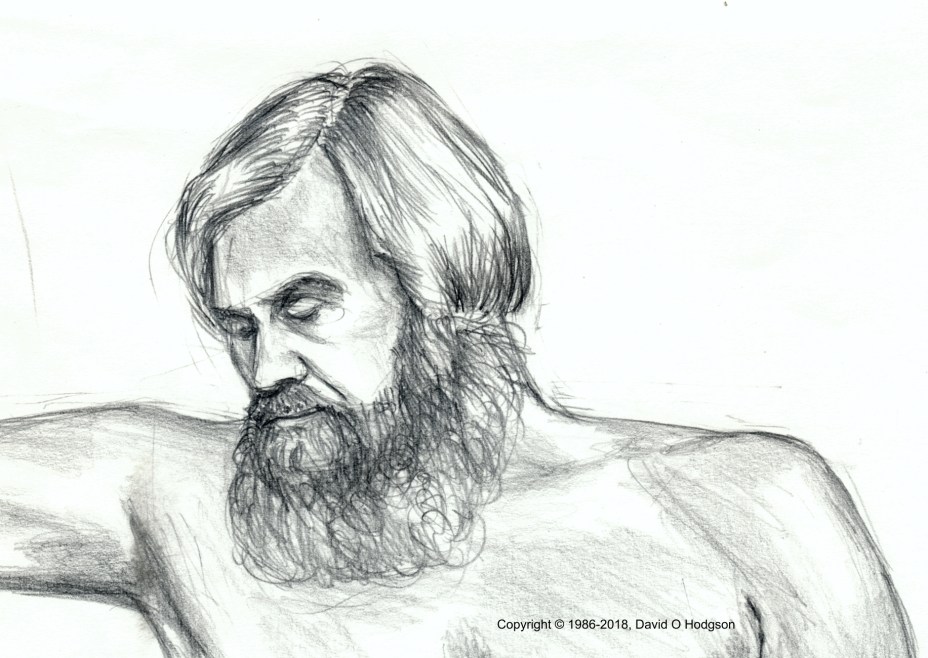

Life Study, 2003
The image above is a scan from a life drawing in pencil that I produced in 2003. This was one of several drawings that I recently had scanned professionally, because the original image size is simply too large (about 24” x 19”) for my equipment.
The issue of the “right size” at which to create artwork has concerned me several times over the years, and I generally haven’t received much guidance on the subject.
When I was growing up, there seemed to be a general attitude (even among my teachers) that the goal of producing artwork was to create a “pretty picture to hang on a wall”, so the “correct” size was simply that at which you wanted to be able to view the picture.
As I described in an earlier post, it was only when I arrived at Imperial College, and became the Publicity Officer of the H G Wells Society there, that I was faced with the requirement to produce artwork that was intended for reproduction. Thus, my original artwork didn’t automatically need to be the same size as the reproduced version.
Avoid Magnification
My initial drawings and paintings were created rather casually on a standard A4 pad, and it was only when I needed to reproduce those as posters that it dawned on me that the posters would be A3 size, i.e., double the size at which I’d created the artwork. In the case where I’d produced a black-and-white line drawing, as below, the result didn’t look too terrible, but some of the others looked quite bad when enlarged!

Comic Strip Artwork, 1981
I learned a harsh lesson from that experience, and, since then, I’ve always endeavored to create my original artwork at a scale larger than 1:1, relative to the final displayed size.
Comic Strip Techniques
I did learn later that much artwork for magazine or newspaper reproduction, such as comic strips, is normally created at twice the size of the intended final reproduction. That was one of those “commercial techniques” that nobody bothered to teach me during my artistic training!
Vector Artwork & Infinite Scaling
In a post on my professional blog, The Two Types of Computer Graphics, I explained the fundamental difference between bitmap and vector representations in computer-based artwork. (Some seem to believe that such artwork is “computer-generated”, but that isn’t the case. Although the computer provides the hardware and software to record the image, it still requires a human artist to perform the actual drawing or painting.)
Whereas bitmap graphics are created on a matrix of pixels, and thus have fixed dimensions, vector artwork consists of shapes entirely described by mathematical functions, which have no predetermined dimensions. Thus, in principle at least, vector artwork can be rendered at any size with no loss of resolution. I featured an example of vector artwork in another recent post, and it’s shown again below. The forms consist entirely of geometric shapes, which the computer can render at any size, so there’s no loss of resolution (although lack of artist-provided detail becomes obvious as the image is magnified).
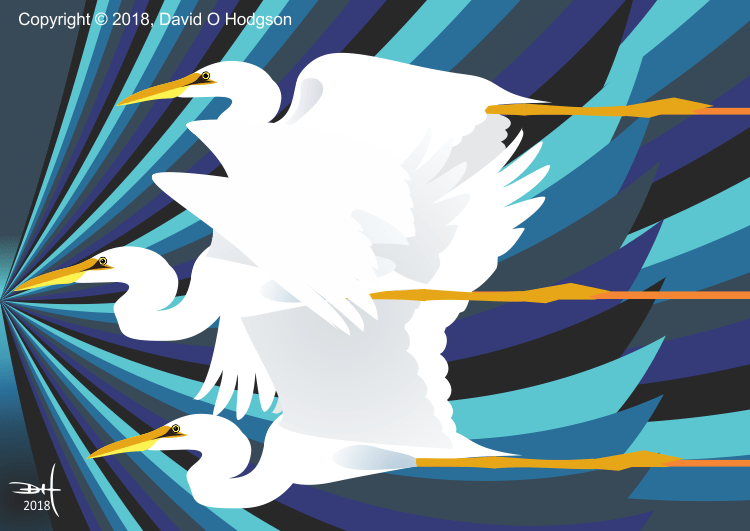
Egret Shock Wave, 2018
Size is Proportional to Time
Returning to the large life study shown at the top of this post, as I became more practiced at such drawings, I tended to make them larger, because that allowed me more control in areas where I wanted to include precise details (such as the face, as shown below in another similarly-sized drawing).

Life Study Detail, 2003
The price to be paid for choosing to produce larger drawings, of course, was that it took me far longer to shade the entire drawing satisfactorily! For that reason, I never actually produced many such drawings.
The advent of computer-based artwork, and the fact that we often now view artwork of all kinds on computer screens, requires artists to think more carefully about the “correct size” for their work; it’s no longer just a question of what will “look good” hanging on a wall!
Life Study, 2003